A quick thought about covers. You've been told your whole life not to judge a book by its cover, but if you're the least bit interested in books as artistic artefacts you'll have read a thousand smarmy blog posts about how in fact yes, readers will completely judge a book by its cover because that's what we're wired to do – first impressions, creatures of visual acuity, yada yada...
I'm no expert and I'm sure it's a tricky thing to get right (in fact I know so, I've interviewed several very inspiring book designers in my day job as a journalist), but it surprises me how many books look good in and of themselves but don't seemed to be designed to stand out on either physical or virtual bookshelves.
I've only seen two great examples of that, one of which was just the other day. Keep in mind, we're not talking about great design per se, just design that stands out among a crowd. Maybe that's what we mean by 'great design' after all...
Anyway, years ago I was in a bookshop scanning the spines of books on a shelf. I always remember an old retail principle where a popular book was shelved front cover out for only a certain period (and only with a certain marketing push from the publisher and retailer), after which it was turned in so only the spine was visible. It's a bit ironic – after all the effort put into book covers, they're often only be visible for a little while, maybe not at all.
That's when I was greeted by this sight;

Maybe the one with the Star of David leaps out at you, but that might be because it's only one of two facing outwards. The other, Naomi Klein's The Shock Doctrine (great book, by the way) has a pretty arresting feature in that blood red cover with the bullet hole, but the one that absolutely slapped me in the face is that one to the left of it, in the middle of the third shelf.
In a sea of everything being nice and straight and perpendicular, that title and the name of the author at odd angles effortlessly drowns everything else out. It's a beautifully simple idea and though I wasn't interested in the book when I picked it up to read the blurb, that spine had already taken me 50 percent of the way towards buying it.
I've also been going to bookshops for the last week or two to research marketing ideas for Falling and had no intention of buying anything other than maybe a bookmark when this cover virtually shouted at me from across the shop.

It's got colour contrast, a very arresting sight in the city reflected perfectly, and the fact that it's standing on its side really grabs you, like the errant angles on the spine in the example above.
So of course I picked it up, and the fact that it's a sci-fi time travel story and has a cover quote by Ernest Cline (of Ready Player One fame) got it over the line – I parted with my $30 quite happily. It wasn't even until I tried to find the cover picture for this post that I realised it wasn't a new novel. Not only was it published in 1986, the guy who wrote it's been dead for years!
The qualities in both examples are things I tried to capture in the cover for Falling. If you haven't seen it elsewhere on this site or on the iBooks, Smashwords or Amazon page, here it is;

No, it's not the most artistic book cover ever designed, and even when I was an actual graphic designer in a past life this kind of thing was never my forte, but the one thing I tried to keep in mind was 'what would this look like an inch high on a computer screen in various ebookshops?'
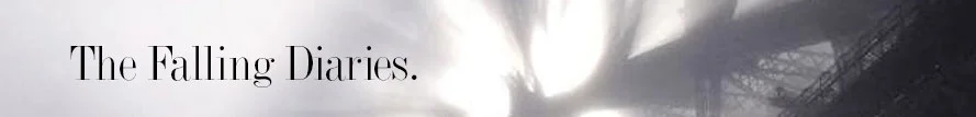
I figure/hope the large area of dark colour that contains the title contrasts with the large area of bright colour that contains the Sydney Harbour Bridge, and that's what draws your eye (maybe the splash of red against the black helps). That's not even the first impression, it's more of a pre-impression, because all you notice is a very hard block of solid colours that contradict/compliment each other.
When you zoom in a bit after that, you might recognise the Harbour Bridge or just notice that it's obviously a large road bridge. You might be intrigued by how mysterious and ethereal it looks with the sunlight streaming through ghostly mist in the foreground (it was actually a picture taken by a News Ltd photographer on a uncharacteristically foggy day in Sydney).
I hope that design thinking gets you 50 percent of the way there, enough to click on it and then, if you're a horror or sci-fi fan, the blurb and the other stuff can do its work.
In other news;
Since publishing properly and getting emails from the various ebook services that Falling has been accepted, the format is correct, etc, I've started to think about marketing. I've got a new document in the Falling folder on my laptop I think will get a lot of use - 'try.odt'. It's where I'm jotting down anyone and everyone I can think to send it to, tell about it, exercises and tasks to market it, etc.
So far I've sent it to friends, family and a couple of the professional networks I belong to, a few of whom said they'd download it and read it. So now, deep breath, onwards and upwards.